Overview
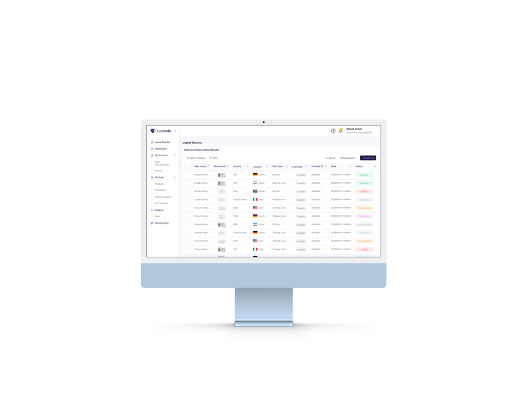
As a product designer at Au10tix, I collaborated with the product experience team to revamp the company’s identity security dashboard, known as the “Console.” This dashboard tracks customer transactions and facilitates onboarding. My focus was to enhance usability, responsiveness, and design consistency across devices.
Stage 1: Empathize
Challenges
The existing Console was outdated, non-responsive, and lacked essential features for effective user navigation and data visualization. Customer feedback highlighted a need for:
Intuitive previews of transactions.
Mobile and tablet compatibility.
A clean, modern interface that simplifies navigation.
Research & Discovery
Understand user needs and identify pain points in the current system.
Methodology:
Conducted interviews with Customer Success Managers (CSMs) and end-users.
Observed workflows to identify key frustrations and goals.
Key Insights:
1. Users need accessible and actionable transaction data.
2. A simplified, responsive design is critical for mobile and tablet use.
3. Clear previews and actionable insights streamline the decision-making process.
Stage 2: Define

Emilie Lane
“Good costumer need good system”
Age 33 old
Work CSM at Airbnb
Lives NY city
Bio
Emily is 33 years old and lives in New York City. She just graduated with a Master’s Degree in Business Administration.
She worked as a CSM at Airbnb for 3 years, and was rewarded for her success.
Goals:
Reliable identity verification, flagging suspicious users, managing onboarding outcomes efficiently.
Tech:
Internet •••••
Social Media •••
Gadget ••
Early Adopter •
Frustrations:
.Lack of clarity when onboarding fails, difficulty accessing data on mobile devices.
Current Design
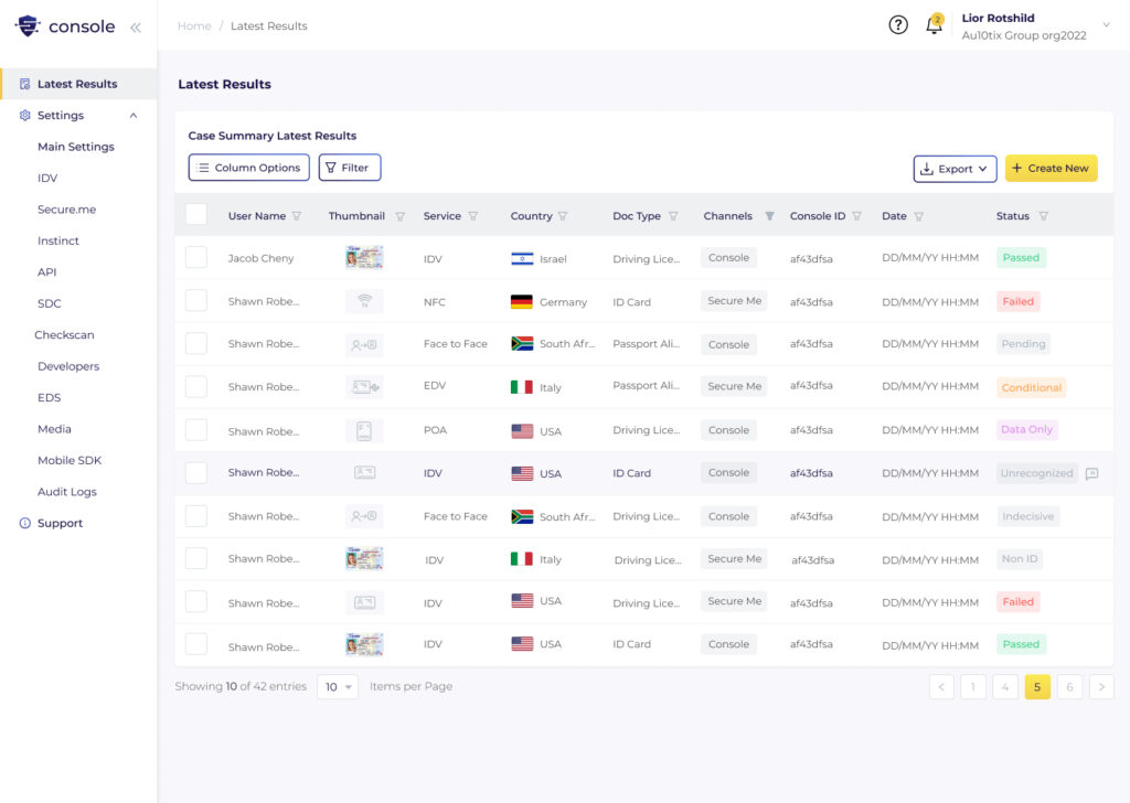
The design of the Au10tix console was outdated and not user friendly.
The costumers said that they needed an option for preview, and for a responsive system that they could work with mobile and tablet devices.
List page
List page
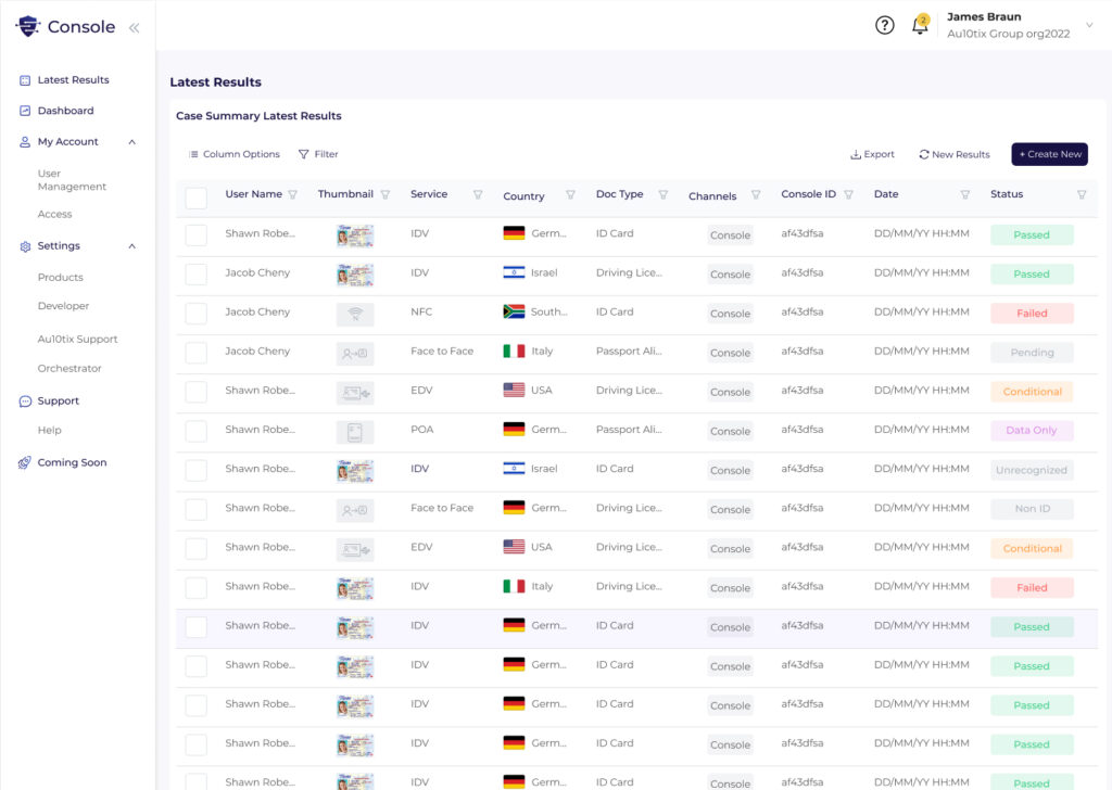
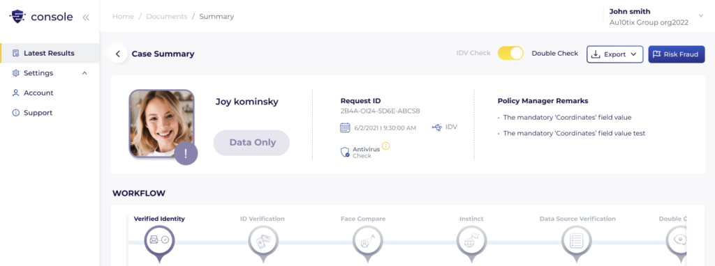
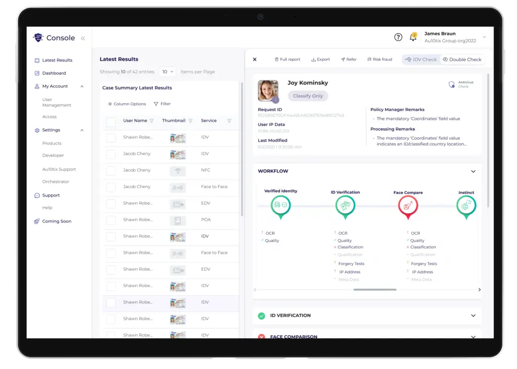
The New Design
Stage 3: Ideate
Sketch
Stage 4: Prototype
Now it's almost ready

The Preview
The can press one case in the table, and the preview will open.
Now you can navigate between the cases, watch the case in few sizes, and make quick actions.
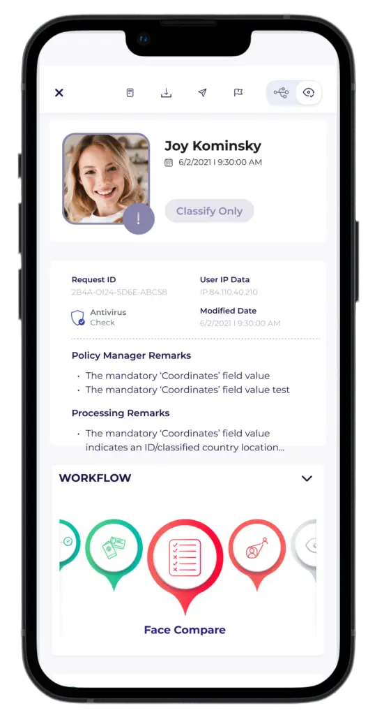
Responsive
Cases can now be opened on a variety of devices, not just desktops.

The Action Bar in the table
After we found the why to make responsive and easy action bar, we check if it could be implement to all the design system of the console.
And… It’s work!
The new style guide
I chose flat icons, clean buttons, and harmonic action bar.
The colors are the colors from the branding, red and green for success and failureץ
Stage 3: Test
Summarize
Based on capacity and roadmap constraints, the company decided to implement the project in several phases. The first phase involved changes to the toolbar, which users appreciated.
Although my involvement ended there as I moved on to another opportunity, I have a warm feeling towards this project.
I cherished the team effort in finding solutions and enjoyed tackling the challenge of presenting the same content across different sizes and devices.
Through this experience, I learned the importance of creatively bridging the gap between the initial vision and the development process.
